A how-to guide for Premiere Pro
by Koen Suidgeest
When your video production contains language(s) not understood by your audience, adding subtitles is the preferred option to make the spoken word understandable. However, having to read subtitles can distract from seeing all the visual actions and – when not used correctly – can confuse the viewing experience. In order for your audience to have the best experience with your production, it is important to adhere to certain conventions. Starting from Metje’s previous guide, I will list them below and will also explain how to create them correctly in Premiere Pro.

Appearance
- Subtitles should not run over more than two lines of text.
- If only one line is needed, use the bottom one.
- Center your subtitles and place them towards the bottom of the screen (unless subtitles would block important on-screen information).
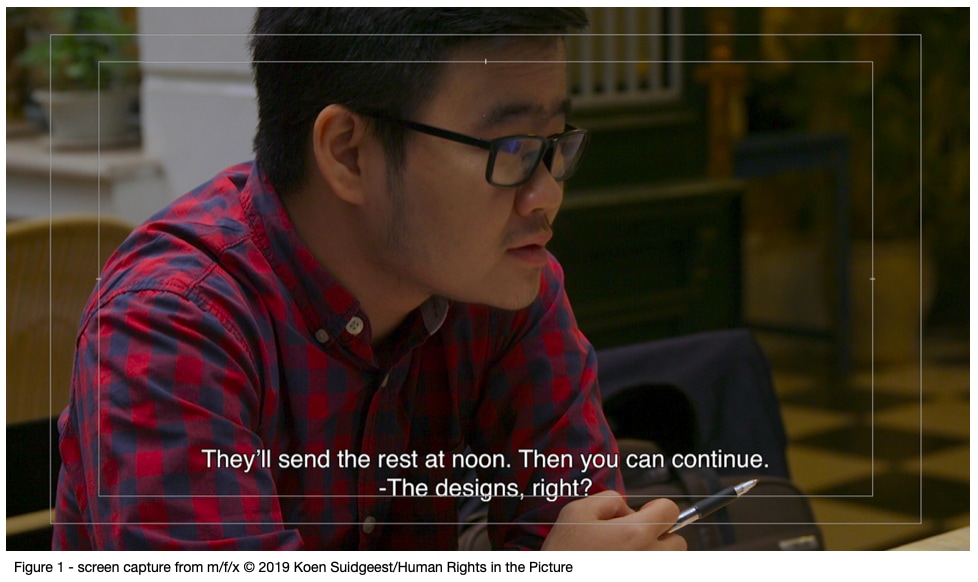
- Subtitles should always stay within the text safe area (see Figure 1).
- Use a sans serif font like Microsoft Sans Serif, Trebuchet MS, Arial or Helvetica.
- Use a white font color and a black outline with 8-10% thickness of the font size.
- Do not use other colors for the font.
- Do not use other effects (drop shadow or black background).
- For a HD 1920 x 1080 video use a font size of around 45-50 (depends on your font).
- Use normal sentence case for your subtitles (start sentences with capitals, end with punctuation marks).
- Use italics to subtitle a voice heard on the telephone, radio or TV.
- Only print spoken words. Do not include character names, explanation of off-screen sounds, or any other information.
Characters and lines
- Use a maximum of 38 characters per line.
- Begin with a literal translation. After that, make adjustments to make it shorter or easier to read and understand.
- Break lines at natural points. The ideal line-break will be at a piece of punctuation like a full stop, comma or dash. If the break has to be elsewhere in the sentence, do so at a logical place (e.g. not between article and noun or pronoun and verb).
- Don’t use three dots or any other punctuation to carry over a sentence between two subtitles.
- Dots are only used when a sentence keeps ‘hanging’ and is not finished by the speaker.
- If one subtitle contains speech of two different speakers, use a separate line for each speaker and start the second line with a dash (as in Figure 1). Do not place a space after the dash.
Timing is everything
- To avoid confusion, it is important to match the subtitle to speech exactly at the onset of speaking.
- Make sure to read along with the title to check whether it’s on-screen long enough.
- Leave a gap of minimum 3 frames between subtitles.
- When possible, do not place subtitles over cuts.
- Never start a subtitle exactly at a cut. Wait at least three frames.
- When a subtitle runs roughly until the end of a shot, keep it on-screen until the final frame so it disappears with the shot.
Subtitles vs. On-screen graphics
Text and any other on-screen graphics, in all kinds of shapes, colors and/or animations, can play an important part in shaping the content of your film. From a creative perspective – and where suitable – anything is allowed. The text you use in this way is part of your visual narrative and considered included in, or part of, the film’s argument and creative expression.
On the contrary, subtitles constitute a separate element that happens outside of the argument of the film. Subtitles should never contribute content that would otherwise be missed (for instance, by a native speaker of the language your film is produced in). That is why there is a strict protocol for the creation and use of subtitles.
New caption tool in Premiere Pro
Since the release of Premiere Pro v.15 in the spring of 2021, the caption tool should now be used to generate subtitles for your video productions. In previous versions this tool wasn’t developed sufficiently to edit with. Hence, generating regular onscreen graphics was the preferred method. But the program’s infrastructure has now significantly changed to favor the caption tool. You can now cut with the captions without losing information, and the fonts size and other settings can be adapted for the whole stream at once. Of course, one great benefit remains its ability to export the subtitle track with timecode markers into a text document, which can then be used for translation into new languages and then easily re-imported into the project.
There are plenty of online sources for you to learn more about the caption tool. You could for instance watch this free, fun but very instructional video by online instructor Premiere Gal.
Sources
http://bbc.github.io/subtitle-guidelines/#presentation
https://www.channel4.com/media/documents/corporate/foi-docs/SG_FLP.pdf
